


How to Design a Travel App That Stands Out in 2026?
“Design is not just what it looks like and feels like. Design is how it works.” - Steve Jobs
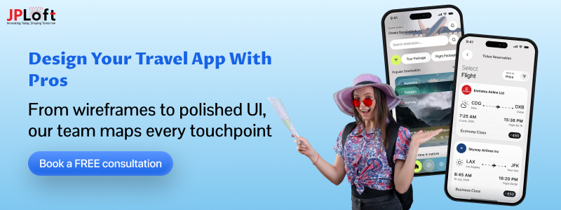
In a world where travelers trust apps more than guidebooks, travel app design has become your brand’s digital passport. It’s no longer just about booking tickets or checking hotel reviews; it’s about crafting seamless, intuitive journeys users love to revisit.
So, how to design a travel app? One that not only looks stunning but also delivers effortless navigation and real-time personalization?
This blog is your go-to guide to travel app design, whether you’re starting from scratch or refining your app’s UI/UX.
Let’s explore what makes travel apps successful, how to build them smartly, and how to stay ahead in this rapidly evolving space.
Key Takeaways:
A successful travel app starts with thoughtful, user-first travel app design that prioritizes clarity and function.
Studying UI/UX patterns from top apps like Hopper and Omio can guide better design decisions.
Key design elements like onboarding, navigation, and visual hierarchy shape the entire user journey.
Following a structured design process helps balance creativity, usability, and development efficiency.
Partnering with a reliable team like JPLoft ensures your travel app’s design is scalable, intuitive, and market-ready.
Travel Apps in 2026: Growth, Trends & Usage Stats You Can’t Ignore
From booking last-minute flights to finding hidden gems in a new city, the best travel apps have become essential tools for modern globetrotters. They're fast, flexible, and deeply personalised, all thanks to the evolution of travel mobile app design over the past few years.
So what’s fueling this global momentum? Let’s look at the numbers.
-
- The global mobile travel industry is projected to reach USD 360 million by 2025, and expand further to USD 1.2 billion by 2035 at a CAGR of 12.7.
- Roughly 80% of travelers use mobile apps for bookings, itinerary planning, and real-time alerts.
- Around 70% of Gen Z and Millennials now prefer intuitive mobile apps with a clean travel app interface over clunky desktop sites.
- Travel apps with strong UI/UX tend to see 25%+ higher engagement than apps with poor usability.
Seamless travel app mobile design is now a major differentiator, especially as users seek minimalist, responsive layouts for bookings and local exploration.
Emerging travel app development trends like voice search, AI trip planners, and social integration are now becoming standard. Users expect speed, personalization, and ease of use, not just functionality.
Yet despite the growth, not all apps succeed. One common reason why online travel apps fail is poor experience design: slow loading screens, broken flows, or interfaces that feel outdated and overwhelming.
Bottom line? If you want users to return (and refer others), you must deliver more than just features; your app’s design needs to guide them effortlessly every step of the way.
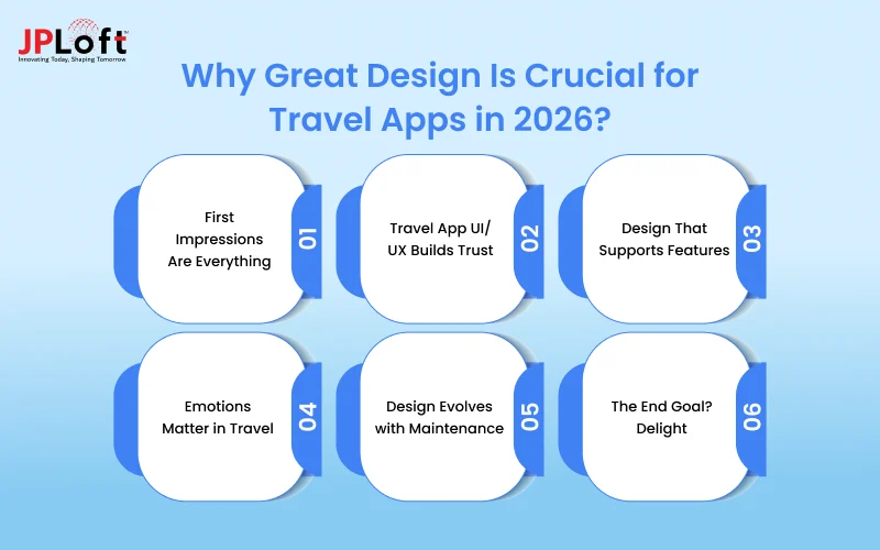
Why Great Design Is Crucial for Travel Apps in 2026?
Building a travel app isn’t just about cramming in features; it’s about designing a smooth, intuitive experience users trust.
Here’s why great design is non-negotiable in 2026:
1. First Impressions Are Everything
Users form opinions about an app in the first few seconds. A confusing layout or slow response instantly turns them off. Many early travel app development challenges arise not from tech but from poor UX planning.
That’s where travel app design UI/UX comes into play. It combines function with emotional resonance, helping users trust the platform from the start.
2. Travel App UI/UX Builds Trust
A clean, responsive travel app UI/UX makes navigation effortless. From trip searches to booking flows, intuitive design reduces drop-offs and boosts in-app conversions.
3. Design That Supports Features
As you integrate advanced filters, real-time updates, or even AI tools, your UI must evolve. Without thoughtful layouts, features go unused. This becomes especially important with the rise of AI in hospitality, where cluttered screens lead to user frustration.
4. Emotions Matter in Travel
Design isn't just functional; it's emotional. Colors, fonts, and interactions influence how users feel. A frictionless experience becomes a reason to return, share, and even recommend your app.
5. Design Evolves with Maintenance
Design isn’t a one-time job. OS updates, user feedback, and scale demand adjustments. That’s where consistent mobile app maintenance comes in; it keeps your UI consistent and bug-free, even as features expand.
6. The End Goal? Delight
Design done right ensures users don’t just download your app; they stick around. If you want real retention, great design isn’t just helpful; it’s essential.
With that emotional foundation in place, let’s now break down the core design components that translate those feelings into real, user-driven travel experiences.
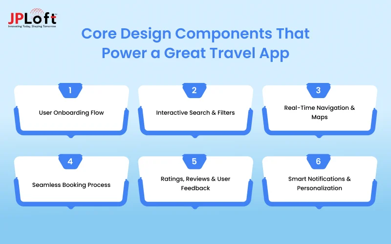
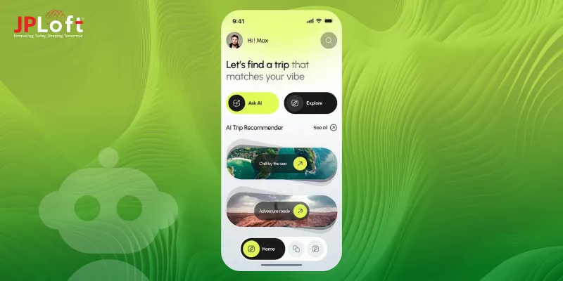
Core Design Components That Power a Great Travel App
Designing a travel app isn't just about making it look good; it's about ensuring that every screen solves a problem, speeds up a decision, or enhances the user journey.
Below are six key components you can’t afford to overlook in a successful travel app design.
► User Onboarding Flow
Your user’s first steps in the app should feel intuitive. Simple sign-up screens, guided walkthroughs, or social logins streamline access and improve retention. This is especially vital in online travel app design, where users expect immediate value.
► Interactive Search & Filters
Great design supports decision-making. Dynamic filters for location, price, ratings, or experiences make exploration effortless. These are core parts of any travel app interface, enhancing both usability and satisfaction.
When defining features, refer to the top travel app features commonly expected in apps like Hopper, Omio, or Kayak, all of which focus on smart, searchable layouts.
► Real-Time Navigation & Maps
Users rely on maps to discover routes, local attractions, or even public transport. Embedding real-time GPS with smooth UI integrations supports both visual clarity and trust.
As noted in any mobile app design guide, the way you display dynamic content can directly influence user confidence and decision-making.
► Seamless Booking Process
From flights to hotels, your booking process must be clean, logical, and fast. Clear CTAs, visual confirmations, and progress indicators are all essential. Poor design here often leads to abandonment.
To improve this, focus on structuring your travel mobile app design around single-click actions and minimal input fields.
► Ratings, Reviews & User Feedback
Modern users seek social proof. Make reviews easily scannable, well-formatted, and tied to specific experiences. A strong guide to travel app design always includes feedback loops and trust signals.
Also, don’t overlook backend quality; successful review systems rely heavily on mobile app testing to maintain consistency and prevent layout bugs.
► Smart Notifications & Personalization
Users appreciate real-time alerts for deals, delays, or recommendations, but only if they're well-timed and relevant. Visual clarity here is critical.
Considering the increasing importance of user trust and security, referencing a travel app security guide during this phase helps prevent design flaws that compromise user data.
Before diving into the step-by-step design process, let’s explore the key components that shape a successful travel app experience.
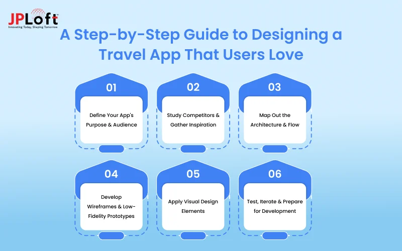
A Step-by-Step Guide to Designing a Travel App That Users Love
If you’re planning to design a travel app from scratch that’s both user-friendly and visually appealing, there’s more to it than just screen layouts.
Great design starts with clarity and ends with real-world functionality.
Here’s a step-by-step guide to travel app design that keeps your users in mind from sketch to screen.
Step 1: Define Your App's Purpose & Audience
Start with questions: Who is this app for? What travel problem are you solving? These answers help define your app’s tone, layout, and features from the start.
Whether you want to build a budget travel planner or a premium concierge-style app, understanding how to create a travel app gives you direction early on. Everything from onboarding to booking should reflect that vision.
Step 2: Study Competitors & Gather Inspiration
Explore what market leaders like Omio, Kayak, and Hopper are doing right and where they fall short. Break down their flows, colors, and user journeys.
This research becomes the backbone of your travel app UI/UX guide and helps identify your own unique value proposition. What feels intuitive? What seems overwhelming? Design decisions should answer those questions clearly.
Step 3: Map Out the Architecture & Flow
Create wireflows, decide on content hierarchy, and structure your screens logically. This stage is critical; it prevents future confusion for both users and developers.
Matching your app’s front-end design with a scalable mobile app tech stack also ensures the interface can support key features like real-time updates or multi-language support without breaking the experience.
Step 4: Develop Wireframes & Low-Fidelity Prototypes
Now start sketching. Create wireframes for major flows: search, results, booking, saved trips, etc. Don’t worry about visuals yet; focus on logic and usability.
Many premium travel apps, including ones like Visit Dubai, achieve their polish through tight coordination between designers and developers. Understanding the cost to develop a travel app like Visit Dubai also helps you scope your design based on timeline and budget.
Step 5: Apply Visual Design Elements
Bring your wireframes to life with brand-aligned colors, fonts, micro-interactions, and animations. Think visual hierarchy, white space, and accessibility.
This is the heart of your travel app UI design, and consistency is key. Every icon, tab, or pop-up should feel like it belongs.
Step 6: Test, Iterate & Prepare for Development
Test on real devices, gather feedback, and revise. Design doesn’t end with a “final file”; it evolves”. Your mockups should be dev-ready and responsive.
If you’re looking to bridge the gap between a polished UI and a production-ready app, studying about testing principles gives real-world insight into successful transitions.
Once you understand the process to design a travel app, the next step is to draw inspiration from real-world successes. Let’s explore standout examples that define excellent UI/UX of a travel app.
Top Travel App UI/UX Examples to Inspire Your Next Design
If you're working on a travel design app, learning from the best can help you make smarter, faster design decisions.
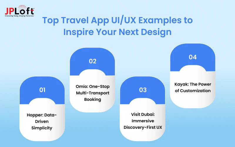
Below are four travel apps that have nailed the art of clean, intuitive, and engaging UI/UX of a travel app, and what you can learn from them.
1] Hopper: Data-Driven Simplicity
Hopper’s sleek interface combines pastel gradients, whitespace, and predictive data to help users make smart decisions fast. Its home screen prioritizes the most-used actions like “Flights” or “Hotels” with intuitive icons and minimal text.
What to learn: Remove clutter. Use color to guide attention. This style of travel app UI design makes even complex pricing models feel approachable.
Want to build something similar? Studying how to create an app like Hopper reveals how visual hierarchy and backend intelligence work hand-in-hand.
2] Omio: One-Stop Multi-Transport Booking
Wondering how to create an app like Omio that streamlines transport options in one place? Omio allows users to compare trains, buses, and flights on one screen. Its layout relies on tabs, iconography, and filters that adapt based on user searches.
What to learn: Contextual search + consistent icon sets = smoother user flow. Its travel app UI/UX balances function with simplicity.
If you're planning a similar solution, make sure your team is equipped to create an app with dynamic layouts that scale with content and data.
3] Visit Dubai: Immersive Discovery-First UX
Visit Dubai offers an experience that blends tourism board branding with ultra-visual navigation. The home screen is video-heavy, backed by location-based recommendations, events, and cultural highlights.
What to learn: Visual storytelling can elevate static content. When planning your own travel app design inspiration, don't underestimate motion and mood.
The platform's polish reflects a premium investment; knowing the cost to create an app like Agoda or Visit Dubai early on helps you plan for such high-end experiences.
4] Kayak: The Power of Customization
Curious about how to develop an app like Kayak that offers rich features without overwhelming users? Kayak delivers powerful search and personalization in a very compact interface. Users can set preferences, create price alerts, and compare flexible travel options without feeling overwhelmed.
What to learn: Smart defaults and user controls can simplify advanced features. For a scalable travel app UI/UX experience, learn how big players structure their settings and filters.
Brands aiming to add AI, filters, and live pricing might benefit from exploring how to build an AI app that doesn’t complicate the design.
How Much Does It Cost to Design a Travel App?
When it comes to launching a successful travel platform, great design isn’t just about visual polish; it’s part of how your app makes money.
In fact, effective UI/UX is one of the most overlooked factors while choosing travel app monetization strategies, directly influencing retention, upgrades, and repeat bookings.
A thoughtful travel mobile app design streamlines the user journey, increases engagement, and strengthens trust. But how much should you expect to spend on design?
Let’s break it down
|
Design Factor |
Estimated Cost Impact |
|
Number of Screens |
More screens = Higher cost |
|
Platform (iOS/Android/Cross) |
Cross-platform can reduce redundancy |
|
UX Research & Wireframing |
~$1,000 – $3,000 |
|
Visual/UI Design (Branding, UI) |
~$2,000 – $7,000+ |
|
Animations & Interactions |
~$500 – $2,000 |
|
Testing & Iteration Rounds |
~$1,000 – $3,000 |
|
Tools Used (Figma, Adobe XD) |
Software licenses or collaboration |
|
Designer’s Location & Expertise |
US/UK-based = higher; Asia = affordable |
Investing in early prototyping and user flow validation saves you thousands later in development. That’s why many startups and enterprises alike work closely with a mobile app maintenance services not just to fix bugs post-launch, but to keep the design experience consistent and evolving.
If you’re aiming for a polished UI with long-term scalability, hiring one of the top mobile app development companies in the USA may cost more, but you’ll benefit from deep design expertise, full-stack collaboration, and performance-focused testing.
And following a detailed process to design a travel app ensures that your layout, visuals, and accessibility checks don’t fall through the cracks. From mockups to micro-interactions, modern travel app mobile design is about clarity, consistency, and conversion.
Pro Tips to Improve Your Travel App’s UI/UX in 2026
Design is more than pretty colors. It’s how your app thinks. Whether you're building a basic planner or a high-end travel design app, investing in an intuitive travel app UI/UX ensures users don’t just visit; they stick around.
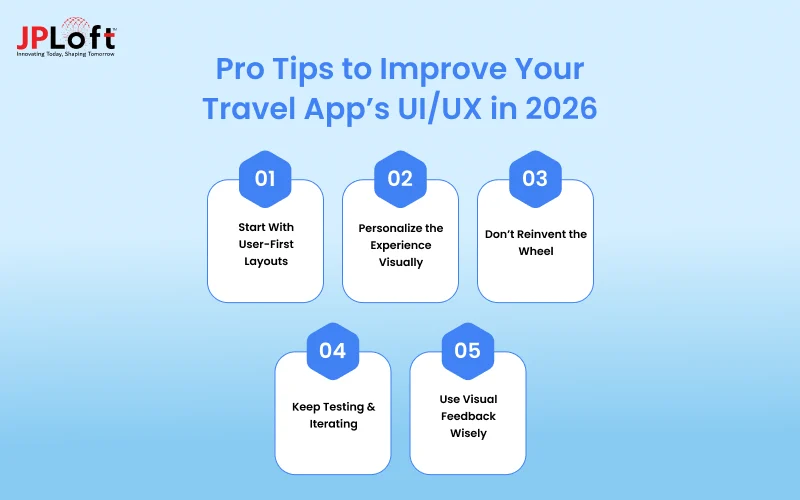
Here are 5 design strategies that will help elevate your app experience:
A] Start With User-First Layouts
Clarity beats cleverness. Every element in your travel app interface should serve a function and reduce decision fatigue. From the home screen to filters, users should know what to do without guessing.
Skipping design research often leads to rework later. In fact, teams who ignore UX early often face higher revisions and a greater cost to develop a travel app due to usability issues found post-launch.
B] Personalize the Experience Visually
Offer tailored suggestions, saved trips, or local guides based on user behavior. Personal dashboards create stickiness and delight.
Immersive elements are a growing trend. Forward-thinking companies are exploring AR in travel apps to overlay real-world locations with digital directions, reviews, and visual highlights.
C] Don’t Reinvent the Wheel
Look at successful apps like Omio for design patterns that work. Seamless booking flows, clean tab structures, and intuitive filters are worth replicating.
If you’re unsure where to begin, study Omio’s approach to design and adapt those proven elements to suit your unique user base.
D] Keep Testing & Iterating
Design is never “done”. User feedback should drive tweaks to layout, fonts, button placements, and animations. Continuous testing is what keeps great apps ahead.
To stay agile and scalable, it’s often smart to hire dedicated developers who understand design systems, responsive layouts, and modern UI frameworks.
E] Use Visual Feedback Wisely
Subtle transitions, loaders, and micro-interactions make the app feel alive, but don’t go overboard. Animations should guide the user, not distract them.
Following a structured travel app design UI/UX guide helps ensure that your interface remains both delightful and efficient across devices.
Design That Sells: Elevate Your Travel App with JPLoft!
A great travel app starts with a great design, and that’s exactly what we deliver at JPLoft.
From wireframes to wow-worthy interfaces, our team builds mobile experiences that are intuitive, scalable, and tailored to your audience. Whether you're targeting frequent flyers or adventure seekers, we design apps that people don’t just use; they love.
Ready to transform your idea into a beautifully crafted product?
Partner with a trusted travel app development company like JPLoft, and let’s bring your vision to life pixel by pixel, screen by screen.
Conclusion
Great design isn’t just decoration; it’s the reason users stay, explore, and book again. Whether you're focused on a minimalist layout or exploring immersive features, your UI/UX of a travel app plays a vital role in the overall experience.
By following a structured travel app design guide, paying attention to user flows, and testing relentlessly, you can design a travel app that delights and converts.
In 2026, the winning apps will be those that combine smart features with even smarter design. The question is, will yours be one of them?
FAQs
Begin with clear goals, user research, and wireframes, then apply intuitive UI/UX design and test thoroughly. A structured process to design a travel app ensures usability, scalability, and user satisfaction.
The key is creating a user-friendly flow that simplifies searches, bookings, and navigation. A clean travel app interface helps users move from point A to point B without confusion.
Begin by defining your audience and features. From there, follow a structured travel app design guide that includes wireframes, visual hierarchy, and usability testing.
It varies by features, but most apps include 10–15 screens: onboarding, home, search, results, booking, profile, etc. A simpler travel mobile app UI design can reduce this count.
Absolutely. Many modern apps use 3D travel design app features to create immersive experiences. Just ensure they don’t compromise speed or usability.
Depending on complexity, it usually takes 4–8 weeks for complete online travel app design, including research, wireframes, mockups, and iterations.

Kris Jacobs brings 20+ years of experience solving complex digital product challenges through strategic thinking and user-centric design. With deep exposure to on-demand services, entertainment, travel, and interactive platforms, she collaborates across teams to shape scalable, engaging solutions that align business goals with intuitive user experiences across evolving digital landscapes.


Share this blog