


People decide within a few seconds whether a dating app feels right or not.
They look at the first screen, the first profile, and how easy it is to say hello. If any of those feels clumsy, they uninstall and open a competitor.
That is why design carries so much weight in this category. Every dating product sells nearly the same promise: meet someone. What separates one from another is how it feels to use, how safe it feels, and how little effort each step demands.
This dating app design guide covers the full process, from planning and screen layouts to trust features, visual choices, testing, and budget.
If you want to design a dating app that people keep using after the first week, start reading here.
What Makes Dating App Design Important?
A dating app asks users to do something personal: share photos, describe themselves, and talk to strangers. Design decides whether they feel comfortable doing that.
Here is where dating app UI/UX design directly affects results:
-
Activation: Users who finish onboarding and build a complete profile are far more useful to the platform than users who quit on step two.
-
Match quality: Profile layouts decide how much information a person sees before they swipe or reply.
-
Conversation rates: A match that never turns into a chat is a dead end. Chat design and first-message prompts push people past that point.
-
Safety perception: Visible verification badges, simple report buttons, and clear privacy controls change how willing people are to engage.
-
Retention: Most dating apps lose a large share of new users in the first few weeks, retaining users on dating apps is a huge task.
How to Plan a Dating App Design?
Design work should begin on paper, long before anyone opens Figma. If you are still choosing a concept, browse the best dating app ideas first. Once the idea is fixed, four planning steps keep the later work focused.
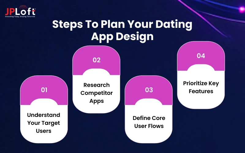
1. Understand Your Target Users
"Singles" is not a target audience. A young person in a city looking for casual dates and an older person looking for long-term companionship need different things from an interface.
Define your audience by:
-
Age range and comfort with technology
-
Relationship goal (casual, serious, friendship, marriage)
-
Location and language
-
Identity or community (LGBTQ+, religious, professional, or age-specific groups)
-
Device habits (mostly mobile, mostly iOS, mostly low-bandwidth Android)
Niche audiences usually need adjusted flows, extra verification, or different profile fields. The process is explained in this guide on how to develop a niche dating app.
2. Research Competitor Apps
Install the top apps in your category and use them for a week.
Make notes on:
-
How many steps sign-up takes
-
What a profile asks for
-
How matching is presented
-
What is free and what is locked behind payment
-
Where the app feels slow, confusing, or pushy
Read app store reviews too. One-star reviews are a free list of design problems. Complaints about fake profiles, hidden paywalls, and ignored reports show you where users feel let down.
A good starting list of products to study is in our roundup of the best dating apps.
3. Define Core User Flows
A user flow is the path someone takes to complete one goal.
Sketch these before drawing any screen:
-
Install → sign up → create profile → see first match candidate
-
Browse profiles → like → match → send first message
-
Receive a message → read → reply
-
Report a user → confirm → get feedback
-
Free user → hit a limit → view premium → subscribe
Count the taps in each flow. If a common action takes more than three or four taps, look for a shortcut.
4. Prioritize Key Features
Shipping every feature in version one slows the launch and clutters the interface.
Split features into groups:
|
Priority |
Examples |
|
Must have |
Sign-up, profile, discovery, matching, chat, report/block, notifications |
|
Should have |
Verification, filters, photo prompts, read receipts |
|
Could have |
Video chat, voice notes, gamified features, AI icebreakers |
|
Later |
Events, in-app dates, wearable integrations |
To build this list for your own product, use our breakdown of top dating app features as a reference.
Essential Dating App UI/UX Design Principles
Good dating app UI/UX design rests on a few habits that apply to nearly every product in this space.
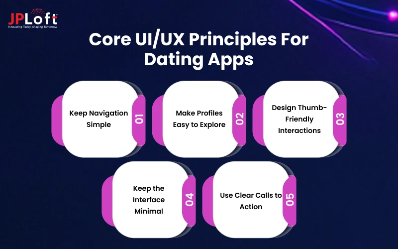
Explore the principles of dating app design here:
1. Keep Navigation Simple
Most dating apps work well with a bottom tab bar holding four or five items:
-
Discover
-
Likes or Matches
-
Messages
-
Profile
2. Make Profiles Easy to Explore
A profile is the product's main content. Treat it like a page that must work in under ten seconds.
-
Lead with the strongest photo at full width.
-
Place short text blocks between photos so the profile reads as a sequence.
-
Show shared interests or mutual connections near the top.
-
Let people like or comment on a specific photo or answer, as Hinge does. That gives the other person something to reply to.
-
Keep optional fields collapsed so the screen does not turn into a form.
-
Design Thumb-Friendly Interactions
Most people use dating apps with one hand, often in bed or on public transport. Put primary actions in the lower half of the screen, where the thumb reaches easily.
Practical rules:
-
Touch targets should be at least 44×44 points on iOS and 48×48 dp on Android.
-
Provide button alternatives to swipe gestures. Some users have motor difficulties or simply dislike swiping.
-
Leave space between like and dislike buttons so nobody taps the wrong one by accident.
-
Offer an undo option for mistaken passes. It costs little to build, and users notice when it is missing.
3. Keep the Interface Minimal
Every extra badge, banner, or promotional card competes with the profile. Remove anything that does not help someone decide, match, or talk.
A useful test: cover one element at a time and ask whether the screen still works. If it does, that element probably does not belong.
4. Use Clear Calls to Action
Each screen should have one obvious primary action. On the profile screen it might be "Like." In the chat list it might be "Say hello." On a paywall it should be a single highlighted plan with the price visible.
Write button labels as verbs that describe the outcome: "Send message," "Verify my profile," "Unmatch." Avoid vague labels like "Continue" or "Submit" when something more specific is available.
Key Screens to Design in a Dating App
To create a dating app that feels simple and complete, start with seven core screens, each serving a distinct purpose.
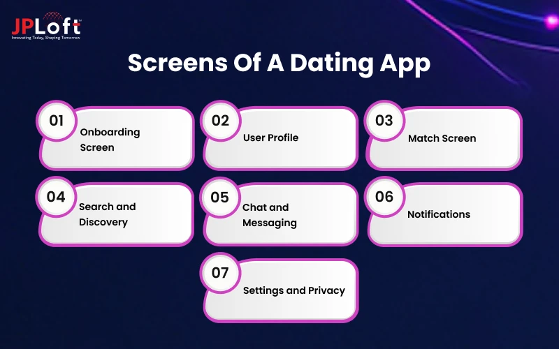
Here are the important screens to design in a dating app:
1. Onboarding Screen
Onboarding should collect only what the app needs to start working. A common sequence:
-
Phone number, email, or social sign-in
-
Name, birth date, and gender
-
Who they want to meet
-
A minimum of two or three photos
-
A few interests or prompt answers
-
Location and notification permissions
Design notes:
-
Show a progress indicator so users know how long it will take.
-
Ask for permissions at the moment they are needed, with a one-line reason. "Allow location to see people nearby" works better than a bare system pop-up.
-
Let people skip optional steps and return to them later.
-
Give photo guidance, such as "Clear face photos get more replies," so profiles start strong.
Gender and orientation fields need extra care. Offer more than two options, allow multiple selections, and let users choose whether to display them. The specific needs of this audience are covered in our guide to creating an LGBTQ+ dating app.
2. User Profile
The profile has two sides: how users build their own and how they view others'.
For the editing side:
-
Drag-and-drop photo ordering
-
Short prompts with character counters
-
A completeness indicator that suggests the next field to fill
-
A preview mode showing how others see the profile
For the viewing side, follow the exploration guidance above. Give users quick access to report and block from the profile itself, not only from settings.
3. Match Screen
The match moment is the app's payoff. Many products show a full-screen celebration with both photos and two options: send a message or keep browsing.
Make that screen useful as well as pleasant. Add a suggested opener tied to something on the other person's profile. Keep the animation short, because users who see it dozens of times will start to find it slow.
4. Search and Discovery
Discovery can take several shapes:
-
Card stack (swipe left or right), the Tinder format
-
Scrollable feed with interactions on individual items, closer to Hinge
-
Grid or list with filters, common in apps focused on browsing
-
Curated daily picks, which limit choices on purpose
The right format depends on your audience and business goals. Whatever the layout, the order of profiles is decided by dating app algorithms working behind the screen.
Filters should be easy to open and easy to reset. Age and distance are standard. Add others, such as relationship goal, height, or languages, only if your audience asks for them.
5. Chat and Messaging
Chat needs to feel fast and quiet.
Core elements:
-
Message list with the most recent conversations first
-
Typing indicators and delivery status
-
Photo and GIF sharing
-
Voice notes, if your audience values them
-
Prompts or icebreakers for empty conversations
-
An accessible menu for report, block, and unmatch
Richer formats change the layout and the moderation workload. If you plan to add live calls, read how to develop a video dating app before finalizing the chat screen.
6. Notifications
Notifications bring people back, and they can also drive them away.
Group them into two tiers:
-
High value: new match, new message, someone liked your profile
-
Low value: daily reminders, promotions, "people near you" alerts
Let users control each category separately. Avoid sending reminders at night. Write copy that sounds like a friend, not a marketing team: "Priya sent you a message" works better than "You have 1 new notification."
7. Settings and Privacy
Settings pages are often rushed, yet this is where users go when they feel uneasy.
Organize it clearly:
-
Account (email, phone, password, delete account)
-
Discovery preferences (age, distance, who sees me)
-
Privacy (hide profile, hide distance, incognito mode)
-
Notifications
-
Blocked users
-
Help and safety center
Use plain language. "Only people I like can see my profile" is clearer than "Restricted visibility mode."
How to Make Dating App Design More Engaging?
A clean layout gets people through the door. The following features keep them using the product.
Here is how to make a dating app design more engaging:
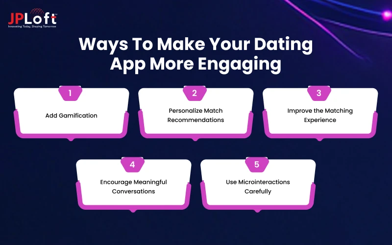
1. Add Gamification
Game elements can make browsing feel more active. Examples in current products include daily picks, streaks, profile completion goals, and quiz-based matching.
Use them with restraint. If a streak counter pressures someone to open the app every day, it can create the kind of compulsive use that users resent. The full list of mechanics and their risks is in Gamification in dating apps.
2. Personalize Match Recommendations
Personalization starts from the data you collect: stated preferences, behavior, and profile content. Design choices that support it:
-
Ask short, useful questions during onboarding
-
Let users give feedback on suggestions ("Show me fewer like this")
-
Explain why someone is recommended ("You both like hiking and live nearby")
Some platforms now use machine learning for recommendations and conversation prompts. Current use cases and their limits are covered in AI in dating apps.
3. Improve the Matching Experience
Small adjustments to the matching flow change how people feel about it:
-
Limit the daily number of profiles in some formats, so each one gets attention
-
Show clear empty states when no one is left nearby, with a suggestion to widen filters
-
Let people rewind their last action
-
Show the reason for a limit, like a daily like cap, before the user hits it
4. Encourage Meaningful Conversations
A match without a message is wasted. Design to reduce the pressure of the first line:
-
Suggested openers based on shared interests
-
Prompts that people can answer in the chat ("Two truths and a lie")
-
Time-bound matches, as Bumble applies, where the clock creates a reason to act
-
Gentle reminders to reply, sent once and not repeated
Voice-based prompts are another option, since hearing someone's tone makes conversations feel less awkward than text, which is why a voice dating app can help users connect more naturally.
5. Use Microinteractions Carefully
Microinteractions are the small animations and responses to taps: a heart that fills, a card that tilts as you swipe, a message that slides in.
They work when they confirm an action quickly. They fail when they add delay. Keep most animations under 300 milliseconds, and test on older phones, where heavy motion can cause lag. Respect the system "reduce motion" setting.
How to Build Trust Through Dating App Design?
Safety is one of the main reasons people hesitate to try or stay on dating platforms. Design can show users that the product takes this seriously.
Let’s explore proven ways to design your dating app:
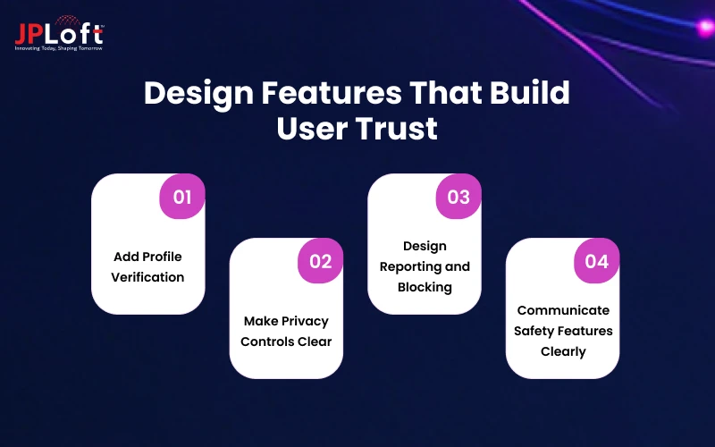
1. Add Profile Verification
Verification reduces fake accounts and gives users a signal to rely on.
Common methods include:
-
Selfie matching, where the user copies a pose, and the app compares it with profile photos
-
Government ID checks
-
Phone number confirmation
-
Social account linking
Display a verified badge in a consistent spot, next to the name on both cards and full profiles. Add a short tooltip that explains what the badge means.
Automated checks reduce manual review time, which is one of the biggest benefits of AI-powered dating app identity verification.
2. Make Privacy Controls Clear
Users should know who can see their profile, location, and activity. Put the main controls in settings and add shortcuts where they matter, for instance, a "hide my distance" toggle in the profile editor.
Show precise location only when needed. Many apps display distance in ranges to prevent anyone from working out a home address.
The technical side of protecting this data is covered by dating app security, which includes measures like encryption and server-side location handling.
3. Design Reporting and Blocking
Reporting tools should be one or two taps away from any profile and from any chat.
A solid flow looks like this:
-
Tap the menu on a profile or message
-
Choose a reason from a short list
-
Add an optional note or screenshot
-
See a confirmation message
-
Receive a follow-up on the outcome, where possible
Blocking should take effect immediately and hide both profiles from each other. Do not make users scroll through a long form to report harassment.
4. Communicate Safety Features Clearly
Safety tools that nobody can find do not help anyone.
Build a visible safety center with:
-
Tips for first dates
-
Explanations of verification and reporting
-
Emergency contacts or links to local helplines
-
Optional features such as sharing a date's details with a trusted contact
Place a short safety reminder before a user's first message or first date plan, not only in a help page.
How to Choose Colors and Visual Elements?
Visual design sets the mood in the first moment. It should fit the audience and stay consistent.
Let’s explore the ways to choose the right color and visual elements:
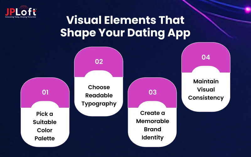
1. Pick a Suitable Color Palette
Color affects how a product feels, though no color guarantees results. Some patterns seen in the market:
|
Color |
Common association in dating apps |
|
Red, pink |
Romance, energy (Tinder uses a gradient from pink to orange) |
|
Yellow |
Optimism, friendliness (Bumble) |
|
Blue, purple |
Calm, trust, sophistication |
|
Black, gold |
Exclusivity, premium positioning |
Choose one primary color, one accent, and neutral tones for backgrounds and text.
Check contrast ratios against WCAG guidelines: 4.5:1 for body text is the standard minimum. Test your palette in dark mode as well, since many users run it by default.
2. Choose Readable Typography
-
Use one or two typefaces. A rounded sans-serif suggests friendliness, while a clean geometric one feels modern.
-
Keep body text at 16px or above on mobile.
-
Set line height around 1.4 to 1.5 times the font size.
-
Support dynamic type, so users who increase system font size get a usable layout.
Older audiences benefit most from larger text, stronger contrast, and fewer gestures, so prioritize them if you plan to create a senior dating app.
3. Create a Memorable Brand Identity
Your logo, icon style, tone of voice, and illustrations should feel like one system. Think about how the app name looks on a phone home screen, how the icon reads at a small size, and how your microcopy sounds.
A playful brand can use casual copy and bright illustrations. A premium brand needs more restraint in both.
4. Maintain Visual Consistency
Build a design system before screens multiply. It should include:
-
Color and type tokens
-
Button, input, and card components
-
Icon set and spacing scale
-
Rules for states (hover, pressed, disabled, error)
A shared component library speeds up handoff to developers and prevents the small inconsistencies that make an app feel unfinished.
Keeping up with dating app UI design trends helps you decide what to adopt.
Current patterns include larger photo-first layouts, prompt-based profiles, video and voice elements, and more inclusive gender options. A wider view of these shifts is in dating app development trends.
How to Test Dating App UI/UX?
Wondering how to test dating app UI/UX? These simple steps will help you evaluate your app's design, usability, and overall user experience.
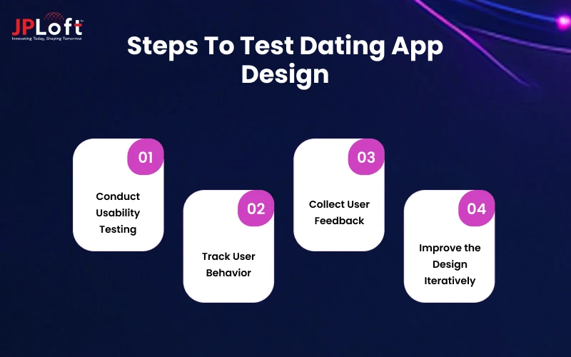
Let's explore the key steps in detail:
1. Conduct Usability Testing
Recruit five to eight people from your target audience for each round. Give them tasks, such as "create a profile" or "report this user," and watch where they hesitate. Record sessions with permission.
Run tests on clickable prototypes before development starts. Fixing a flow in Figma takes hours, while fixing it in production code takes days.
2. Track User Behavior
Once you build a dating app, measure what users do. Useful metrics:
-
Onboarding completion rate and drop-off by step
-
Time to first match
-
Match-to-message rate
-
Messages per conversation
-
Day 1, Day 7, and Day 30 retention
-
Report rate and block rate
-
Conversion from free to paid
Tools such as Firebase, Mixpanel, or Amplitude can capture these events, and funnel charts show where people leave.
3. Collect User Feedback
Add short in-app prompts after key moments, like a first match or a first date, and a visible feedback option in settings.
Read app store reviews on a schedule. Interviews with active and churned users often explain what the numbers cannot.
4. Improve the Design Iteratively
Treat the first release as a starting point. A simple cycle works:
-
Pick one problem from the data
-
Form a hypothesis for a fix
-
Build a small change
-
A/B test it on a portion of users
-
Keep it, adjust it, or drop it
Change one thing per test so you can tell what caused any difference.
Before submission, check Apple and Google policy requirements for dating and user-generated content. You should avoid all the possible reasons that can stop you from getting your dating app approved on the App Store.
Dating App Design Examples to Take Inspiration From
Studying live products gives you dating app design ideas you can adapt. Each of the four below made a different bet.
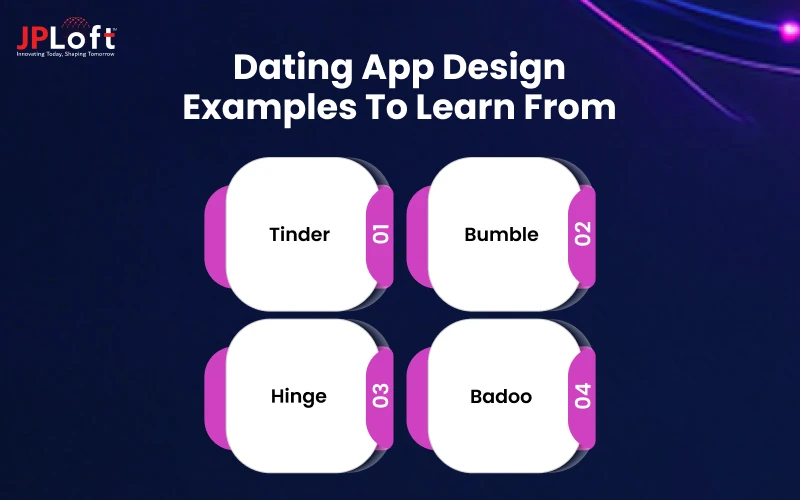
Explore them here:
1. Tinder
Tinder popularized the swipe card stack. Its profile cards are photo-led with minimal text, and the match screen leads straight to chat. The interface is simple to learn, which helped it spread.
What to take from it: A short learning curve and a fast core loop.
If you want to build something with a similar format, start with how to create an app like Tinder.
2. Bumble
Bumble kept the swipe mechanic and changed the rules of contact. In matches between a man and a woman, the woman sends the first message, and the match expires after 24 hours if nobody writes.
The yellow palette and rounded shapes give it a friendlier tone than many competitors.
It also includes Bumble BFF and Bizz modes for friendships and networking, which affects how the home navigation is organized.
What to take from it: A rule built into the interface can set the tone of the whole community.
For budgeting a product like this, you can explore the overall cost to develop an app like Bumble.
3. Hinge
Hinge replaced the swipe stack with a scrolling profile. Users fill in written prompts and choose photos, and other people like or comment on a specific item.
This gives the conversation a starting point. The company's tagline, "Designed to be deleted," signals a goal of getting people into relationships and out of the app.
What to take from it: Structured profiles can lead to better first messages.
A direct side-by-side of the two apps is available in our Hinge vs Bumble comparison.
4. Badoo
Badoo has been on the market for a long time and mixes a swipe-style feature with live video, a social-feed feel, and photo verification.
Its interface carries more elements than Tinder's, which suits users who want to browse and chat in several ways.
What to take from it: a broader feature set can work if navigation stays clear.
How Much Does Dating App Design Cost?
Design cost depends on scope, team location, and how much research you do. The figures below are rough planning ranges for design work only, and they exclude development.
|
Scope |
What it includes |
Approximate range (USD) |
|
Basic MVP design |
15–25 screens, simple style guide, clickable prototype |
$5,000 – $12,000 |
|
Mid-level product |
30–50 screens, design system, user research, usability testing |
$12,000 – $30,000 |
|
Advanced product |
50+ screens, custom animations, multiple user modes, extended testing |
$30,000 – $60,000+ |
Factors that move the number:
-
Number of screens and platforms (iOS, Android, web)
-
Custom illustration or animation versus standard components
-
User research and testing rounds
-
Complexity of features such as video, audio, or AI recommendations
-
Agency rates in different regions
Design is one part of the total budget. For the complete estimate including development, see the cost to build a dating app.
Extras: Design a Dating Website
Designing a dating website follows the same principles with a few differences.
Desktop screens give you room for side-by-side layouts, such as a profile list next to a chat window. Responsive behavior matters, because many visitors will arrive on mobile browsers.
Keep sign-up short, since web visitors drop off faster than app users who already installed. If you are planning how to design a dating website, start with the mobile layout and expand upward.
The full process is in our guide to creating a dating website.
How Can JPLoft Help You Design a Dating App?
Designing a dating product involves more decisions than most app categories: privacy, moderation, monetization, and community behavior all show up in the interface. A design team that has handled these before can save you rounds of rework.
JPLoft, as a dating app development company, works with founders and businesses on dating products across these areas:
-
Discovery and research: Defining the audience, mapping competitors, and writing the feature list.
-
UI/UX design: Wireframes, high-fidelity screens, and clickable prototypes for iOS, Android, and web.
-
Development: Building the app from approved designs with the help of developers.
-
Safety features: Verification, reporting, and moderation flows.
-
Testing and launch support: Usability testing and App Store and Google Play submission.
If you want a second opinion on an existing concept or need a team to take it from sketch to release, you can reach out to JPLoft and share your idea.
Final Thoughts
Designing a dating app comes down to a sequence of clear decisions. Know who the app is for. Study what competitors do well and where users complain.
Map the core flows before drawing screens. Build trust with verification, privacy, and reporting tools that people can find. Test with real users, and revise based on what they do.
Teams often repeat the same errors in scope, testing, and launch planning.
The dating app design ideas in this guide give you a working structure: simple navigation, profile layouts that invite conversation, thumb-friendly controls, and visible safety.
How you combine them depends on your audience, and the best way to learn what works for them is to put a prototype in front of them early.
FAQs
Start with planning, not screens. Define your target users, study competitor apps and their reviews, map the core user flows, and split features into must-have, should-have, could-have, and later. This keeps the first version focused and the design work efficient.
Most dating apps are built around seven core screens: onboarding, user profile, match, search and discovery, chat and messaging, notifications, and settings and privacy. Each has its own job, from collecting only essential information at sign-up to giving users clear control over privacy.
Show a consistent verified badge with a short explanation, and make privacy controls easy to find. Put report and block options one or two taps from any profile or chat. A visible safety center with first-date tips and emergency resources also helps.
Design alone typically costs about $5,000–$12,000 for an MVP, $12,000–$30,000 for a mid-level product, and $30,000–$60,000+ for an advanced one. These ranges exclude development. Screen count, platforms, custom animation, and research all move the price.
Run usability tests with five to eight target users on a clickable prototype before development. After launch, track onboarding completion, time to first match, match-to-message rate, and Day 1/7/30 retention. Combine that with in-app feedback and A/B tests that change one thing at a time.

Rahul Sukhwal is the CEO and Founder of JPLoft, with 18+ years of experience in software engineering, emerging technologies, and digital product development. His expertise spans artificial intelligence, including AI agents, generative AI, LLMs, chatbots, computer vision, and machine learning, as well as blockchain, IoT, AR/VR, mobile, web, and enterprise software. He focuses on applying these technologies to real business challenges across industries such as healthcare, education, mobility, finance, real estate, and on-demand services.


Share this blog